

Designing for success:
Ecommerce web design trends for maximum impact
Eleanor Hecks, 6 October 2023 E-commerce web design trends change frequently. Implementing the latest styles without dating a website requires finesse. Some trends stick around because they work and stand the test of time, so it’s best to choose proven design elements for maximum impact. Here are the most common features of a well-designed e-commerce page.
1. Choose eye-popping colors
Nearly every e-commerce store seems to have the same neutral colors and minimalistic theme. Add something sharp and eye-catching to grab user attention and help the site stand out from competitors.
A bright splash of color or images with unusual colors might be all that’s needed. There is an entire psychology to color choices, so consider the emotional impact each one might create in users.

image source: www.lovevery.com
LoveEvery sells brain-building toys for children. Note the bright splash of aqua over the image. The color is repeated across images and on the toys, pulling everything together in a cohesive design.
2. Hone in on headlines
The headlines can make or break an online store. They are often the first thing users see when landing on a page. Try different combinations of words and see which performs best. E-commerce web design trends such as animation can be worked into headlines and easily swapped out if they bog down the servers or don’t create impact.
Try different fonts and sizes for headlines, creating a hierarchy the user recognizes. With some testing, designers can find the best options for their audiences.
3. Embrace seasonal elements
Keep a page fresh and current by adding in a few seasonal elements. Choose sales that match the time of year and offer discounts for certain holidays. Consider what customers most want and match their interests with the images and offers in the e-commerce store.

image source: www.epromos.com
Check out how ePromos adds a seasonal image and headline to pull users in and remind them what they most want during the fall. Even the supporting text talks about autumn to get people in the mood to shop for the season.
4. Cut the clutter
One of the e-commerce web design trends that never goes out of style is keeping a clutter-free page. The more stuff on a website, the less likely the user will take the next step through the sales funnel. Eliminate anything that doesn’t point site visitors to the call to action (CTA).
Embrace white space. It’s acceptable to have blank spots to give eyes a break from the busyness of digital living. People view videos, see cluttered social media pages and sort through emails daily. A little bit of nothingness goes a long way toward helping them refocus and pay attention to the most important elements.
5. Images that showcase your brand
Take the time to embrace photos and illustrations that showcase the brand’s personality. The old saying that a picture is worth a thousand words holds true. People tend to process images much more easily than words alone. Use how the human brain works in a business’s web design to grab and hold users’ attention.
Images should be relevant to the page and unique enough to show brand personality.

image source: www.shopcider.com
Cider adds a hero image to its landing page that shows examples of what the clothes look like while people live their lives. Notice the fun poses and silly antics of the models.
As the user scrolls down the page, they see other examples of outfits and people posing in selfie mode to take a quick snapshot. The entire vibe is young, fun and interesting.
6. Add micro-animations
Animated elements pull users in and point them down the journey the site owners want. Use arrows that show the way or flashing CTAs to grab people’s attention and move them through the sales funnel.
One thing to keep in mind with micro-animations is not to overdo it. A page becomes busy and jarring fairly easily. Remember that less is more.
7. Strong e-commerce navigation
When creating a strong navigation structure, some tried-and-true methods include placing the menu at the top of the page and limiting the number of categories. However, other trends in e-commerce include using images to navigate to product options so customers can determine what they want.
It’s hard for online shoppers to see the item. They can’t pick it up or test it out. One way around these limitations is to offer photos from every conceivable angle and a video showing the product in use.
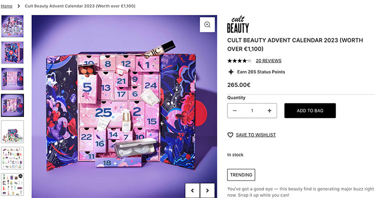
image source: www.cultbeauty.com
Cult Beauty offers several images appearing to the left of the selected picture on the product page. Users who hover over and click each one see more details of the advent calendar. Many beauty products offer an image of a model wearing them so buyers can see if they like the finished look.
8. Keep them clicking
People are used to a TikTok world where they get lost in an algorithm and scroll endlessly until they find something they can’t resist. A website should offer a similar experience. Users should interact with various elements from the minute they land on the page. Each step should provide additional information and build more desire for the product through purchase completion.
Embracing new e-commerce web design trends
Some e-commerce web design trends stick around, and others disappear rather quickly. Web designers should embrace new methods, test them and see what works for their audience. It’s OK to sometimes fail and replace something that isn’t working. Designers don’t know which works best until they try different designs. Experiment and watch sales soar.
Author bio

Eleanor Hecks is the editorial director at Designerly. She’s also a mobile app designer with a focus on user interface. Connect with her about digital marketing, UX or tea on LinkedIn.